Reduced information overload to enable researchers to easily monitor and manage their grants.
Objective
To create a solution for researchers to enable them to easily track their expenses against their budgets and proactively manage their awards (grants).
My work
Lead designer for the Awards Management page.
Redefined the information architecture and minimized feature creep.
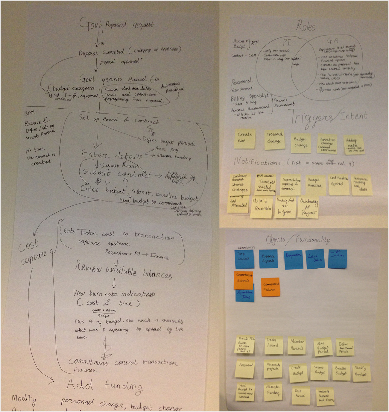
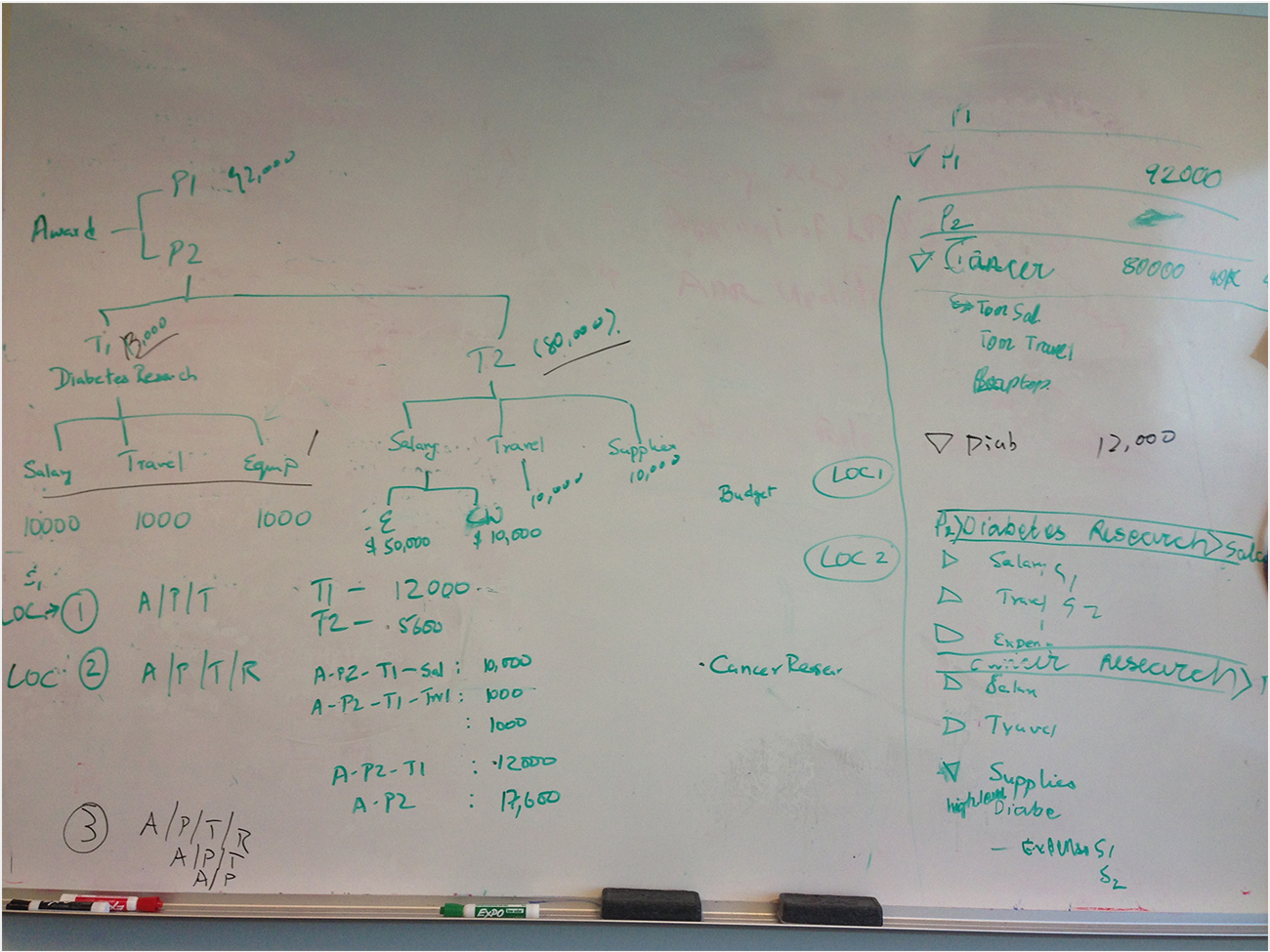
Used improvised affinity diagramming and whiteboarding techniques with Product Managers to understand the domain, ensuring the business requirements were met.
Worked closely with the development team to check that the designs could be implemented using available technology.
Outcome
Product released in 2014
Decrease in user comprehension time
A before/after view of the Award Management project.
Challenge
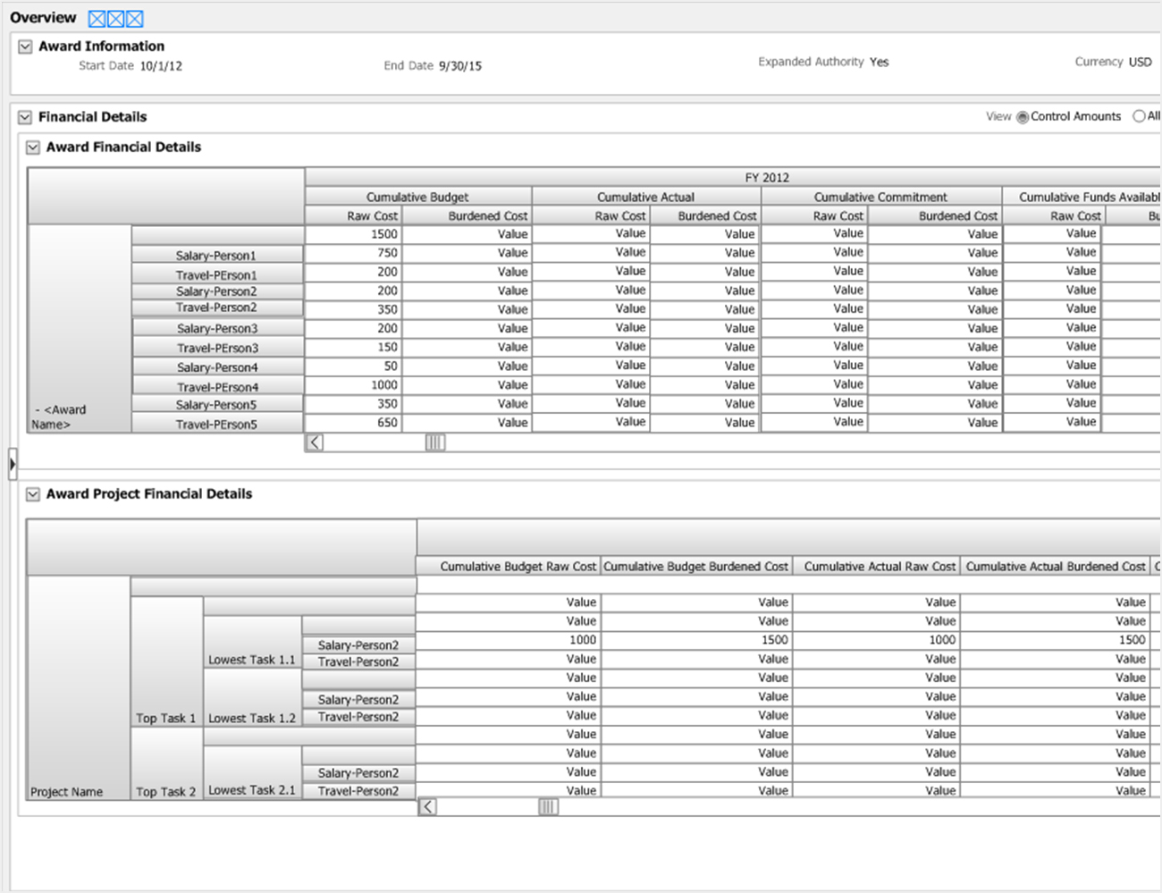
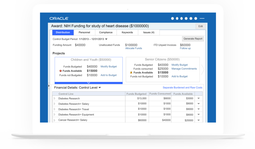
Award management is a tool mainly used by casual users such as professors and researchers. The old designs of the tool had two huge pivot tables with fourteen columns and rows broken into multiple subcategories. This amount of information was too overwhelming for the end-users whose primary goal was to just ensure that their expenses were in accordance with their budget and funds allocated. The goal of this project was to minimize the clutter on the page and present the data to the users such that it would empower them to manage their awards.
Solution
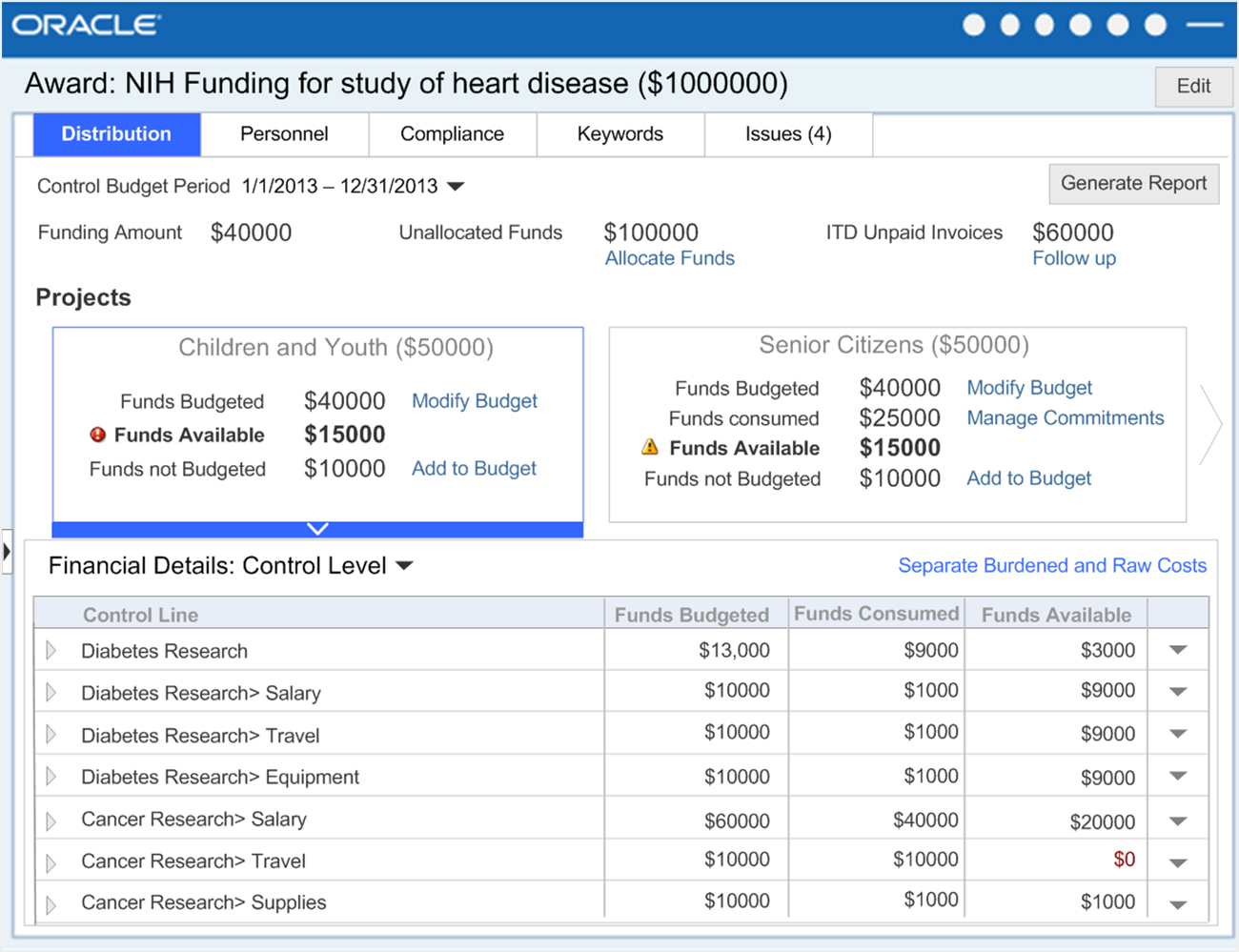
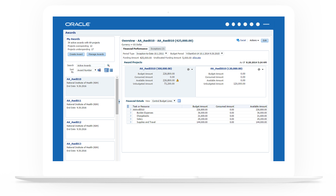
The new solution provides the users a quick overview of how the funds have been distributed across different projects and how they have been utilized. I used the design metaphors such as bank account expenditures to make the UI more friendly for casual users. The information needed by users to help them decide if they need to see the details of a specific expenditure is surfaced at the top. Master detail interaction in the solution enables users to see award usage of one project in context of other projects and helps them decide if they want to move funds between projects.
Project highlights
Requirements gathering and objective definition
Used an improvised version of affinity diagramming and whiteboarding to help PMs articulate target users, requirements, and use cases.
Rapid iterative design
Designed high-level concepts using metaphors to enable the PMs to understand the information hierarchy from the user’s perspective and save the product from falling into the feature creep trap. Negotiated and sold the idea of a minimalistic solution to the product team.
Helped product managers communicate the more important use cases by involving them in my design iterations and having in depth discussion about addressing multiple scenarios.
Final product
The new design helps researchers get an overview of their awards and prioritize which award projects to look at without forcing them to analyze all the data available to them. The actions menu on the project cards enables them to take actions within context. While the awards pane acts a tool to browse through multiple awards, it can be collapsed if the user wants to focus on a single award.
Only the most important details are surfaced on the page to minimize the clutter. Data that users will seldom need has been hidden using show hide tables. Users can choose to view the entire data in a spreadsheet by clicking on the details icon.